Lorem ipsum dolor sit amet, consectetur adipiscing elit, sed do eiusmod tempor incididunt ut labore et dolore magna aliqua.
Maps
Dynamic symbol styling: New ways to configure icon state
Heading
It is now easier to add dynamic icons to Mapbox maps. New ‘icon appearance’ style definitions in the Mapbox SDKs can trigger icons to change color, size, rotation, or position in a consistent, intuitive way — without juggling platform-specific code or a myriad of graphic files. Developers can now define how custom symbols look and change directly in the map style, whether they are building for web, iOS, or Android. When managing dynamic, data-driven visuals such as availability statuses or scaling symbols based on zoom level, appearances ensure map icons are performant, consistent across platforms, and easy to build.
Dynamic icons made delightfully simple
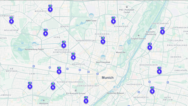
An ‘icon appearance’ is a defined visual state for a symbol on a Mapbox map. Using appearance configurations, a symbol can have multiple visual states. For example, an electric vehicle charging station icon might use a green design as its default appearance to indicate availability. The same icon could shift to orange to signal it is in use, or to red to show it is currently unavailable.
Previously, each icon symbol was limited to a single, static look. If a developer wanted to visually reflect real-time symbol changes, they needed to write platform-specific code and manage separate symbol definitions for each design variant.
Developers can now define just a single vector icon and the default appearance (color, size, etc.) in the style, along with definition of any other appearance options and what triggers the change. Changes can be configured once directly in the style, or added and updated with the runtime API. Developers no longer need to write custom rendering logic or manually swap icons on the client side, and icons will behave consistently across web and mobile.
Icon appearances configurations are enabled by underlying support for vector icons. Previously, Mapbox Studio and the web and mobile SDKs rasterized all icon files, which made it difficult to scale icon customization. Designers needed to use an outside graphics editor to create multiple variants of each icon in different colors or configurations. Icon files had to be uploaded and managed manually in the style across platforms. Here is an example for how to add custom vector icons. Support for vector icons can reduce the number of icon files developers need to manage, and save development time and resources.
Deliver the right information with icons that respond, rotate, and resize
The initial release of icon appearances includes support for several key symbol layout properties: changing the icon image design, changing the size of the icon, rotating the icon, and adjusting the position of the icon. These parameters give precise control over how a symbol looks in different scenarios.
For example, an application can use appearances to manage visual hierarchy of POIs across zoom levels. Developers can define the size and detail of symbols upon initial load to emphasize certain points-of-interest (POIs) or POI categories that are important to see right away. As a user zooms in, minimized POIs can appear larger and with more detail. This is a way to show large quantities of POIs without clustering, making the map highly readable and usable while maintaining an appropriate level of POI detail and density.
Icon appearances can also show changes or status updates for a certain variable; for example, changes in the speed and direction of wind, or visually showing which stores are currently open.
Icon appearances also unlock more interactive and understandable map design. For example, developers can create styles where icons change the image, size, or orientation when hovered over or clicked.
How to get started with icon appearances
Icon appearances are now available in public preview for all customers. Appearances can be configured for icons in any Mapbox style. Check the icon appearances Documentation pages and for web, iOS and Android for how to get started configuring appearances.
Lorem ipsum dolor sit amet, consectetur adipiscing elit, sed do eiusmod tempor incididunt ut labore et dolore magna aliqua.
Lorem ipsum dolor sit amet, consectetur adipiscing elit, sed do eiusmod tempor incididunt ut labore et dolore magna aliqua.
Authors


guest
Mira Ala-Kantti

Mapbox